

What does 2021 have in store for us?
Online marketing remains the main pawn. Even if 2021 is also unpredictable given the pandemic context, graphic trends will help us refresh our brand. Don’t forget! People have changed both their habits and their outlook on life and the environment. The strategy related to the presence of a brand online should follow graphic design trends so that our business is not ignored. In order to be able to understand the importance of trends, it would be advisable to start from the idea that the visual experience is what guides the potential customer in making navigation decisions in the online environment (whether we are talking about shopping, advertisements, articles, etc.).
7 ideas that can inspire you.
3D design still in trend. It is certainly not new to anyone, but it tries to follow technological advances and takes advantage of the possibilities brought by modern software. Basically, 3D components give a much stronger virtual reality, incredibly close to our reality. Designers opt for simple backgrounds in the context of 3D elements, the idea being to capture the viewer’s attention. They can also be used as animations. Thus, the content of a material is exploited and presented in the most original way possible.
Illuminating and Ultimate gray – the colors of 2021. Did the classic blue of 2020 anticipate the pandemic? If every year is associated with a representative color that will be in trend, 2021 was the exception. Why? Because it was assigned 2 colors: Illuminating and Ultimate gray. The latter are not chosen by chance, as they simply reflect the impact of the pandemic on the human being. P.S: Every year, the Pantone Color Institute gives news, globally, about color trends, regardless of the field we want to refer to. Illuminating is a bright yellow shade that wants to bring back hope. Basically, we can associate it with the attempt/desire to convey positive messages to those around. After the melancholy state that blue left us, this color comes with a vibrant, positive and optimistic energy. Ultimate gray gives us the confidence we need, balance, stability and wisdom. Both colors are closely related to nature, meaning the freedom that people need in 2021. A few color palettes have also been proposed, all revolving around the two shades. Before you make a decision, keep in mind that color psychology will help you understand if your choices are stimulating in the direction you want your consumers to go.
Emoji is becoming a graphic trend, even if until now this concept was not used very often. Those little yellow faces are in the spotlight in 2021 as they manage to convey exactly what we’re thinking/feeling and contribute to emotional engagement. Translating the emoji into a 3D design brings a new breath. Icons reinforce the message being conveyed, regardless of where it is positioned. It is a method by which creativity can be exposed as original as possible because they can be created as we want, starting from the template known to everyone.
Nature – inspiration for designers. In recent years, the idea of organic design has begun to enter the top of the trends for simplicity and naturalness. The product graphics are inspired by nature, taking over various elements and minimalism. Whether we mean color palettes, lights, tones, lines, etc. We can say that this growth is also reinforced by the pandemic effect, with people feeling the need to connect with nature, regardless of the means chosen. And this because 2020 showed us how important freedom is for us and what is the role of the external environment. Everything starts from the desire to have a healthy, less polluted environment.
Gold design. Metallic effects are also fashionable in 2021. They are associated with minimalist design and represent the technique by which we bring out what we want. Even if we sometimes look at the idea with reluctance (against our own design), it is not to be neglected. Among the metallic effects used is the gold design. It is a versatile choice that can be used in combination with several colors in an appropriate context.
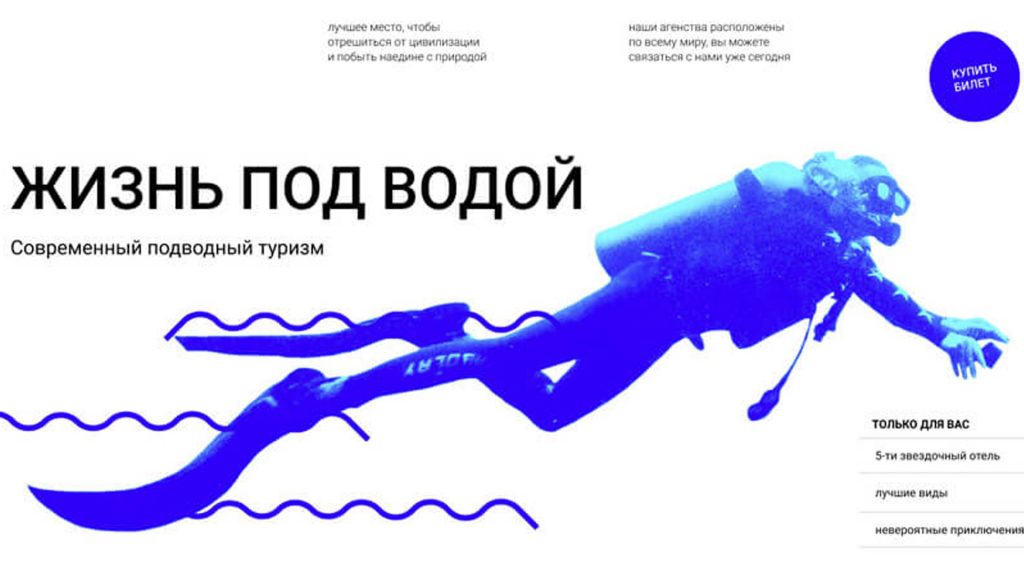
Monochrome or duo design. Modern design means simplicity and beauty, hence the idea of opting for limited color palettes. Fewer colors used means a less complex design that can be analyzed by the human brain much more easily. Even though it has a smooth and cool look, it makes up for the abundance of illustrations around. If we refer to advertisements, in particular. In short, it is about an approach to a theme that wants to convey relaxation, highlighting the emotion of the colors used.
Typography chaos design. Surprising, right? The uncertain period we are going through can be fearlessly expressed in graphic design because “clutter” is a trend in 2021. If until now graphic elements were organized, the trend has changed.